Looking back: STA 199 overview
Lecture 25
Duke University
STA 199 - Fall 2024
December 3, 2024
Warm-up
Announcements
- Final exam review session: Tuesday, 12/10, 11 am - 1 pm in Bio Sci 111 – come with questions!
- Modified office hours during finals week: See “finals week” tab on the office hours sheet
- Course and TA evaluations due Monday, 12/9
- TA of the Year award nominations: Email dus@sta.duke.edu.
Final exam
Thursday, 12/14, 9 am - 12 pm
- Review posted on course website
- You should have received an email with your room assignment: Bio Sci 111 or Gross 107 (or testing center)
- Cheat sheet: 8.5x11, both sides, hand written or typed, any content you want, must be prepared by you
- Also bring a pencil and eraser (you’re allowed to use a pen, but you might not want to)
Thursday: Looking further
Options:
Bayesian inference
Building data dashboards
Building data-centric interactive web apps

Projects
Remaining items
Write up
Presentation / video
Peer evaluation
Questions?
Live code review
Effective communication
Take A Sad Plot & Make It Better
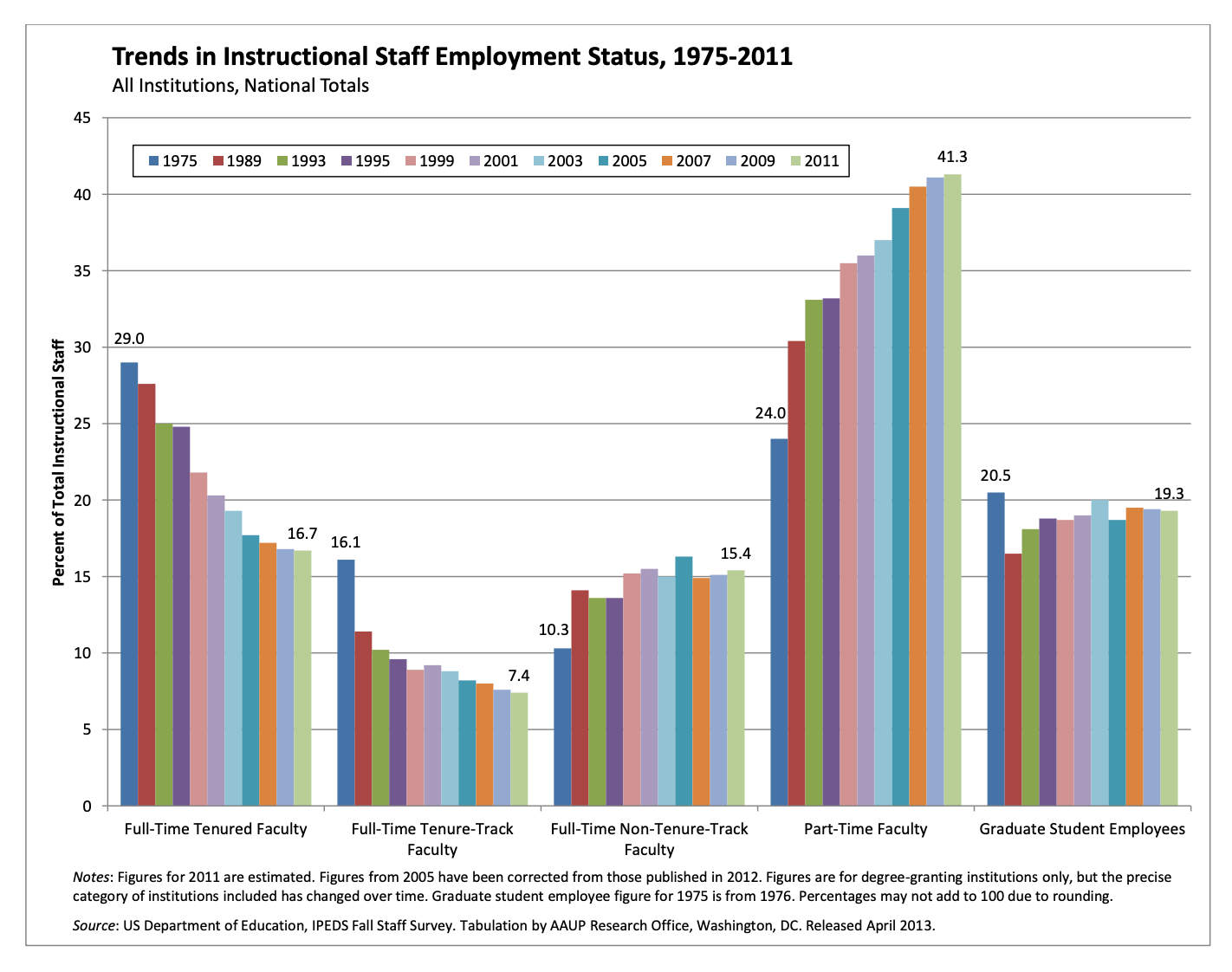
Trends instructional staff employees in universities
The American Association of University Professors (AAUP) is a nonprofit membership association of faculty and other academic professionals. This report by the AAUP shows trends in instructional staff employees between 1975 and 2011, and contains the following image. What trends are apparent in this visualization?
ae-20-effective-dataviz
Go to your ae project in RStudio.
If you haven’t yet done so, make sure all of your changes up to this point are committed and pushed, i.e., there’s nothing left in your Git pane.
If you haven’t yet done so, click Pull to get today’s application exercise file: ae-20-effective-dataviz.qmd.
Work through the application exercise in class, and render, commit, and push your edits.
Data prep
Code
library(tidyverse)
library(scales)

staff <- read_csv("data/instructional-staff.csv")

staff_long <- staff |>
  pivot_longer(
    cols = -faculty_type, names_to = "year",
    values_to = "percentage"
  ) |>
  mutate(
    percentage = as.numeric(percentage),
    faculty_type = fct_relevel(
      faculty_type,
      "Full-Time Tenured Faculty",
      "Full-Time Tenure-Track Faculty",
      "Full-Time Non-Tenure-Track Faculty",
      "Part-Time Faculty",
      "Graduate Student Employees"
    ),
    year = as.numeric(year),
    faculty_type_color = if_else(faculty_type == "Part-Time Faculty", "firebrick3", "gray40")
  )
Pick a purpose
Code
p <- ggplot(
  staff_long,
  aes(
    x = year,
    y = percentage,
    color = faculty_type_color, group = faculty_type
    )
  ) +
  geom_line(linewidth = 1, show.legend = FALSE) +
  labs(
    x = NULL,
    y = "Percent of Total Instructional Staff",
    color = NULL,
    title = "Trends in Instructional Staff Employment Status, 1975-2011",
    subtitle = "All Institutions, National Totals",
    caption = "Source: US Department of Education, IPEDS Fall Staff Survey"
  ) +
  scale_y_continuous(labels = label_percent(accuracy = 1, scale = 1)) +
  scale_color_identity() +
  theme(
    plot.caption = element_text(size = 8, hjust = 0),
    plot.margin = margin(0.1, 0.6, 0.1, 0.1, unit = "in")
  ) +
  coord_cartesian(clip = "off") +
  annotate(
    geom = "text",
    x = 2012, y = 41, label = "Part-Time\nFaculty",
    color = "firebrick3", hjust = "left", size = 5
  ) +
  annotate(
    geom = "text",
    x = 2012, y = 13.5, label = "Other\nFaculty",
    color = "gray40", hjust = "left", size = 5
  ) +
  annotate(
    geom = "segment",
    x = 2011.5, xend = 2011.5,
    y = 7, yend = 20,
    color = "gray40", linetype = "dotted"
  )

p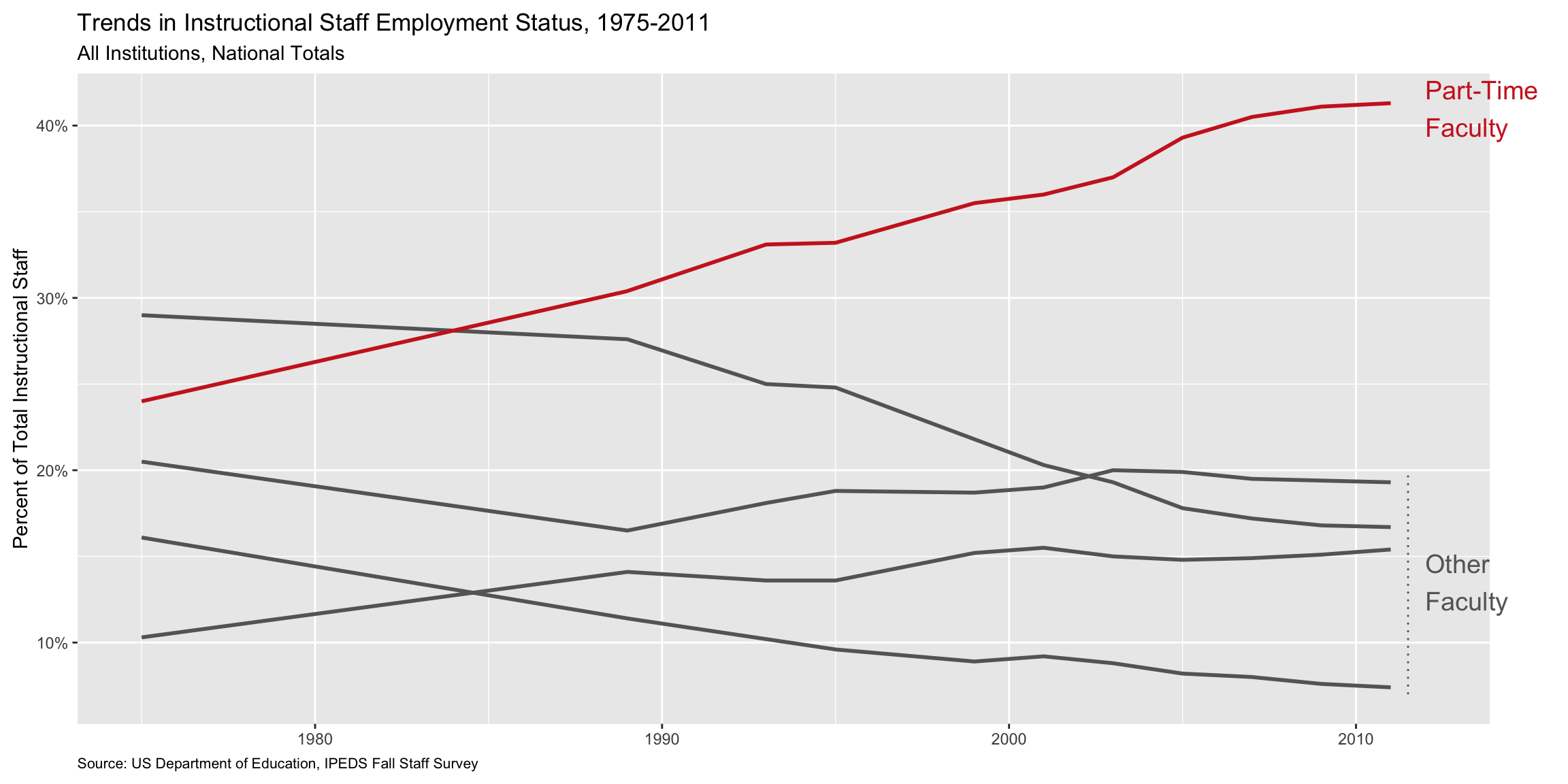
Use labels to communicate the message
Code
p +
  labs(
    title = "Instruction by part-time faculty on a steady increase",
    subtitle = "Trends in Instructional Staff Employment Status, 1975-2011\nAll Institutions, National Totals",
    caption = "Source: US Department of Education, IPEDS Fall Staff Survey",
    y = "Percent of Total Instructional Staff",
    x = NULL
  )
Simplify
Code
p +
  labs(
    title = "Instruction by part-time faculty on a steady increase",
    subtitle = "Trends in Instructional Staff Employment Status, 1975-2011\nAll Institutions, National Totals",
    caption = "Source: US Department of Education, IPEDS Fall Staff Survey",
    y = "Percent of Total Instructional Staff",
    x = NULL
  ) +
  theme(panel.grid.minor = element_blank())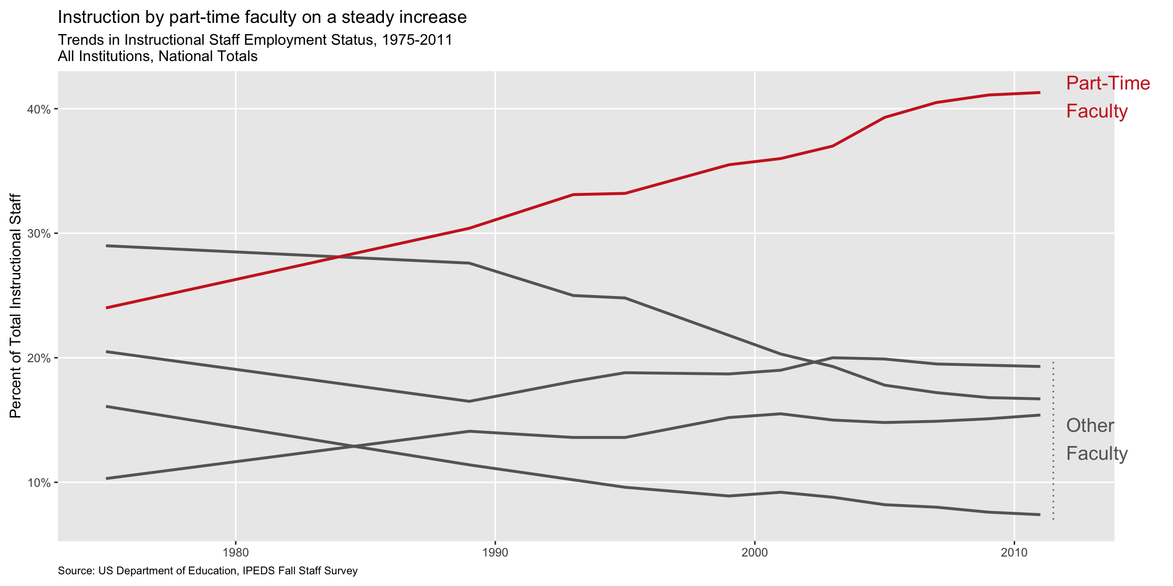
Summary
- Represent percentages as parts of a whole
- Place variables representing time on the x-axis when possible
- Pay attention to data types, e.g., represent time as time on a continuous scale, not years as levels of a categorical variable
- Prefer direct labeling over legends
- Use accessible colors
- Use color to draw attention
- Pick a purpose and label, color, annotate for that purpose
- Communicate your main message directly in the plot labels
- Simplify before you call it done (a.k.a. “Before you leave the house, look in the mirror and take one thing off”)
