AE 08: Durham climate + factors
Getting started
Packages
We will use the tidyverse package in this application exercise.
Data
The data come from https://www.usclimatedata.com/climate/durham/north-carolina/united-states/usnc0192 and are stored as durham-climate.csv in the data folder.
durham_climate <- read_csv("data/durham-climate.csv")And let’s take a look at the data.
durham_climate# A tibble: 12 × 4
month avg_high_f avg_low_f precipitation_in
<chr> <dbl> <dbl> <dbl>
1 January 49 28 4.45
2 February 53 29 3.7
3 March 62 37 4.69
4 April 71 46 3.43
5 May 79 56 4.61
6 June 85 65 4.02
7 July 89 70 3.94
8 August 87 68 4.37
9 September 81 60 4.37
10 October 71 47 3.7
11 November 62 37 3.39
12 December 53 30 3.43Reorder
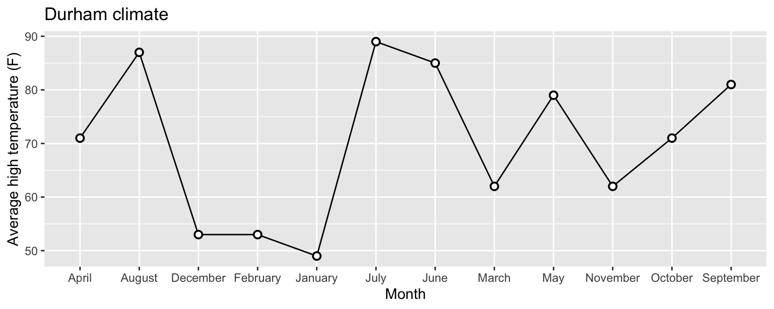
What’s wrong with the following plot?
Add your response here.
ggplot(
  durham_climate,
  aes(x = month, y = avg_high_f, group = 1)
  ) +
  geom_line() +
  geom_point(
    shape = "circle filled", size = 2,
    color = "black", fill = "white", stroke = 1
  ) +
  labs(
    x = "Month",
    y = "Average high temperature (F)",
    title = "Durham climate"
  )
Fix the plot.
# add code hereRecode and reorder
Update the plot above, coloring points based on season. Additionally:
Make sure the legend is on top of the plot and the seasons appear in the legend in the order they appear in the plot (Winter, Spring, Summer, Fall).
-
Use
"circle filled"as theshapefor points, set theirsizeto 3 points, outline (stroke) to 1 point, and fill them in with the following colors:- Winter:
lightskyblue1 - Spring:
chartreuse3 - Summer:
gold2 - Fall:
lightsalmon4
- Winter:
# add code herePivot
Overlay lines for both high and low temperatures on the same plot. Additionally, use different colors for the two lines – a darker color for high and a lighter color for low temperatures.
# add code here